
How to design a brand center
Most brand centers fail the same way. Somebody exports the brand guidelines to PDF, uploads a folder of logos next to it, puts both behind a login, and sends the link round. Six months later the design team is still answering "can you send me the logo?" three times a week, two markets are running a wordmark that was retired last year, and nobody can say how many people have opened it.
That is not a storage failure. It is a design failure. A brand center is a public product with users, and it succeeds or fails on the same things any product does: whether the right person can find the right thing in under a minute, whether they trust that what they found is current, and whether it looks like it came from the brand rather than from the software underneath it.
This guide is about designing that product. It covers the audiences a brand center serves, the anatomy of a brand center homepage, the collections and search that make it navigable, the access and rights model, the accessibility and performance minimums, and the governance that keeps it current a year later. If you want the shorter definition-level piece first, read what is a brand portal. If you want to see a brand center rendered in your own brand before you design one, our brand center generator builds a preview from your website in about a minute.
What a brand center is, and what it is not
A brand center is the public face of your digital asset management: a branded destination where people outside your core creative team, meaning agencies, retail and dealer partners, press, franchisees, distributors and colleagues in other departments, find approved logos, guidelines, campaign assets, product imagery and templates, in the right format and for the right market, without asking anyone.
The industry uses several names for this. Brand center, brand portal, brand hub, brand guidelines portal and brand asset portal all describe the same object, and vendors differ only in emphasis. The naming is not worth arguing about. The distinction that is worth drawing is between the brand center and three things it is regularly confused with.
It is not the DAM. The DAM is the system of record: ingestion, versioning, rights, renditions, permissions, the full library including the raw and the rejected. The brand center is a curated, designed view onto a subset of it. Building the brand center before the library is the common mistake, because everything then has to be published by hand, and a portal that depends on someone remembering to upload files goes out of date within a quarter.
It is not the brand guidelines. Brand guidelines are a document that says what the brand should look like. A brand center is the mechanism that makes the correct thing easier to obtain than the incorrect thing. Lucidpress found in its survey of over 400 brand management professionals that 85% of organisations have brand guidelines while only 30% enforce them consistently. A brand center addresses that gap by distribution rather than by documentation: it makes the approved file the easiest one to obtain.
It is not a marketing microsite. A microsite exists to persuade. A brand center exists to hand people files. Everything about the design follows from that: the hero does not sell a product, the navigation is not a conversion funnel, and the primary success event is a download, not a form submission.
The clearest public example is NASA, which runs a literal NASA Brand Center. Its top level is not Logos, Photos, Videos, Documents. It is Images and Media, Film and Documentary, Merchandise, Strategic Partnerships, and Brand Guidelines. That is a navigation built out of the reasons people arrive, not out of the file types they will eventually download, and it is the single most transferable idea in this guide.
Start from the audiences, not from the assets
Almost every weak brand center shares a root cause: it was structured by whoever owned the files, so it inherited that team's mental model. Design folders became design sections. The photography archive became a photography tab. The result is an information architecture that makes sense to the few people who built it and not to the hundreds who use it.
Start instead by writing down every group that will arrive and what each one wants in their first thirty seconds.
| Audience | Arrives wanting | Fails when |
|---|---|---|
| Press and media | Logo in vector, approved executive portraits, boilerplate, a contact | They have to register to get a logo for a deadline in an hour |
| Agencies and freelancers | Current guidelines, master files, fonts, the campaign brief's assets | They get last quarter's toolkit and nobody tells them it moved |
| Retail, dealer and franchise partners | Point-of-sale kits for their market, in their language and format | Everything is in English and sized for the head office channel mix |
| Internal marketing in other regions | Editable templates, campaign masters, localisation rules | They rebuild the asset from scratch because finding it took longer |
| Sales and customer-facing teams | Product imagery, decks, one-pagers, screenshots | They pull from an image search because the portal needs a VPN |
| Legal and compliance | Rights status, expiry, who used what where | Usage is untracked, so the answer is a guess |
Now cut it. A brand center that tries to serve six audiences equally on one homepage serves none of them. Pick the two or three that generate the most inbound requests today, design the homepage for them, and route the rest through a clearly labelled secondary path. The measure of a good brand center homepage is not how much it contains. It is how quickly the four most common arrivals reach what they came for.
The audience list also determines the access model, which is the second structural decision and the one that is expensive to change later.
The rule that prevents the most disagreement later: put the logo in the open tier. Gating a wordmark behind registration does not protect the brand, it guarantees that a journalist on deadline will right-click the one on your homepage and publish a 40-pixel PNG. The things worth gating are the things that carry cost or risk, meaning licensed photography, unreleased campaigns, editable masters and anything under embargo.
The anatomy of a brand center homepage
There is a structure that works, and it is stable across industries even though the visual treatment should not be. It has six parts.
Here is that structure as a finished page. This is Aurelia, one of the thirty-five brand centers in our gallery, and the six regions appear in order: the wordmark with the words BRAND CENTER beside it, a hero headline about the library rather than about a product, the metrics set as type underneath, the collections row, the quick access rail on the right, and what's new along the bottom.
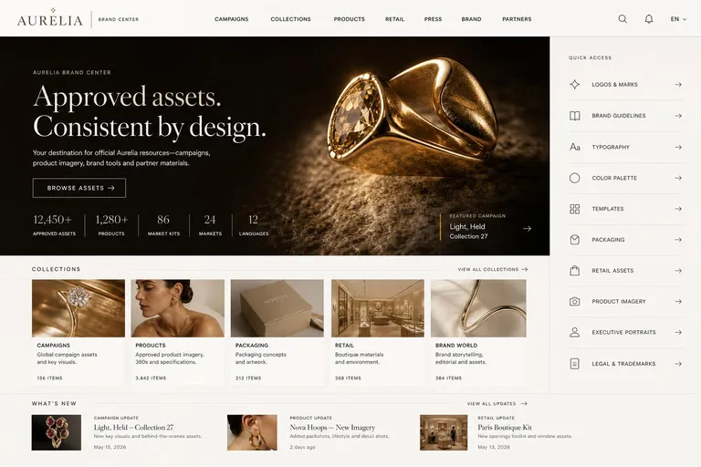
Note the headline. It sells nothing. A jewelry brand has every incentive to put a necklace and a season name at that size, and the brand center is the one page where it should not.
The header
Two jobs. It has to look like the brand's own navigation rather than a software toolbar, and it has to say what the place is. The phrase "Brand Center" as a small label next to the wordmark is more useful than any onboarding modal, because it answers the question a first-time visitor actually has, which is "am I in the right place?".
Put search in the header, visible, on every page. Not behind an icon that expands. Nielsen Norman Group's field research on internal portals found that users who lose confidence in search turn to navigation instead and take much longer to finish their task, and that once frustrated, they tend not to come back to the tool at all. Search is not an extra feature on a brand center. It is what most repeat visitors use first.
The hero
This is where most brand centers go wrong in a way that is invisible to the people who built it. The instinct is to put the current campaign in the hero, because the campaign is what the marketing team is thinking about. The result is a page that reads as an advertisement, and a visitor who came for a logo has to scroll past a product launch to find out this is a resource library at all.
The rule: the hero headline must be about the brand center, not about a product. It should communicate access to approved material. "Everything your brand needs." "One brand, every market." "Approved assets, ready to use." The current campaign belongs on the page, but as a featured collection card or a small eyebrow label, not as the dominant message.
One still image, not a carousel. A carousel uses the whole first screen, and most visitors ignore it. The call to action is resource-led, meaning Browse assets, Explore the library, Find approved content, and never Shop now or Learn more.
Library metrics
A short line of numbers near the hero, set as editorial typography rather than dashboard tiles: assets, product lines, market kits, markets, languages. This does two things. It tells a partner that the thing they need is probably in here, and it tells an internal stakeholder that the library is real. Keep it to three or four figures and keep them true, because a metric that is wrong once is never trusted again.
Collections
Four to six cards, directly below the hero, each with a strong thumbnail, a category title, a one-line description and a small asset count. Cards, not a folder tree.
The naming is where the design work is. Collections should be named after what the visitor came to do, not after the department that produced the file or the format it happens to be in.
| Named after the format | Named after the task |
|---|---|
| Photography | Product imagery, ready for retail |
| Video | Campaign films and cutdowns |
| PDFs | Guidelines and market playbooks |
| Design files | Editable templates for your market |
| Archive 2024 | Previous campaigns, still approved |
| Miscellaneous | Anything with no owner, so delete it |
The last row is not a joke. A Miscellaneous or Other collection is a signal that the taxonomy has an unresolved question in it, and the assets inside will be found by nobody. Resolve the question or drop the assets.
Quick access
A narrow rail, usually to the right, holding the five or six things that never change and that everybody eventually needs: Logos and marks, Brand guidelines, Typography, Colour palette, Templates, and one sector-specific entry such as Dealer assets, Packaging, Executive portraits or Press kit. These are the highest-traffic destinations in any brand center by a wide margin. Giving them a permanent, predictable position is the least expensive improvement available.
What's new
Three recent additions, with thumbnails and dates, at the bottom of the first screen. This section is disproportionately important and almost always missing. It is the only element on the page that answers "is this maintained?", and that question governs whether a partner bookmarks the brand center or goes back to emailing you. If the newest item is eight months old, you have a governance problem that no amount of design will hide.
Make it look like the brand, not like the software
Here is a test worth applying to any brand center, yours or a competitor's. Screenshot the homepage, cover the logo, and show it to someone who knows the sector. If they cannot tell you whose it is, the design has failed, no matter how good the search is.
Brand centers built as a generic template with a colour swap are the norm, and they undermine the exact thing they exist to protect. A brand asking its partners to be rigorous about identity, from a portal that looks like every other portal, is making a weak argument. The design principle is brand-first, software-second: as little visible product chrome as the functionality allows.
These are the elements that make a page look like the brand, roughly in order of how much difference they make:
- Typography. The brand's actual display face in the hero and headings, not the platform's default sans. This is the single biggest determinant of whether the page reads as the brand. If the brand licence does not cover web use, a close pairing is still better than a system stack.
- Photography and its treatment. Crop ratio, colour grade, whether people are in the frame, how much space is left around each image. A brand center for an outdoor brand and one for a private bank should not be able to share an image treatment.
- Density. Luxury and editorial brands need whitespace and few elements per screen. Grocery, retail and industrial brands can carry higher density, and forcing them into a sparse layout makes the page feel empty rather than premium.
- Palette roles, not just palette values. Using the brand's hex codes is the minimum. What separates a good brand center from an average one is assigning those colours consistent roles: which colour is the surface, which is the accent, which one is allowed on a call to action, and which one appears once per page or not at all.
- Grid and card proportion. A four-up square grid and a three-up 16:9 grid give a different impression of the brand before a single word is read.
If you want to see this concretely across sectors, we published thirty-five brand center examples spanning fashion, banking, hospitality, sport, automotive and food, built to the same six-region structure described above and deliberately not sharing a visual language. Three of them, at the same scale:
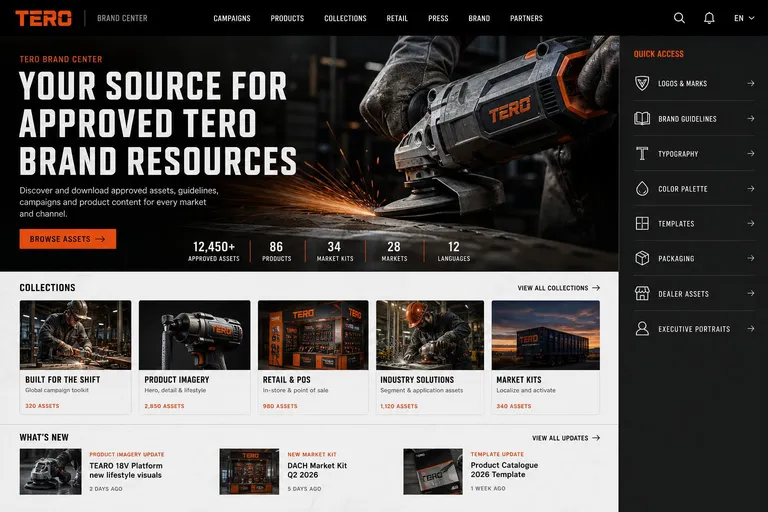
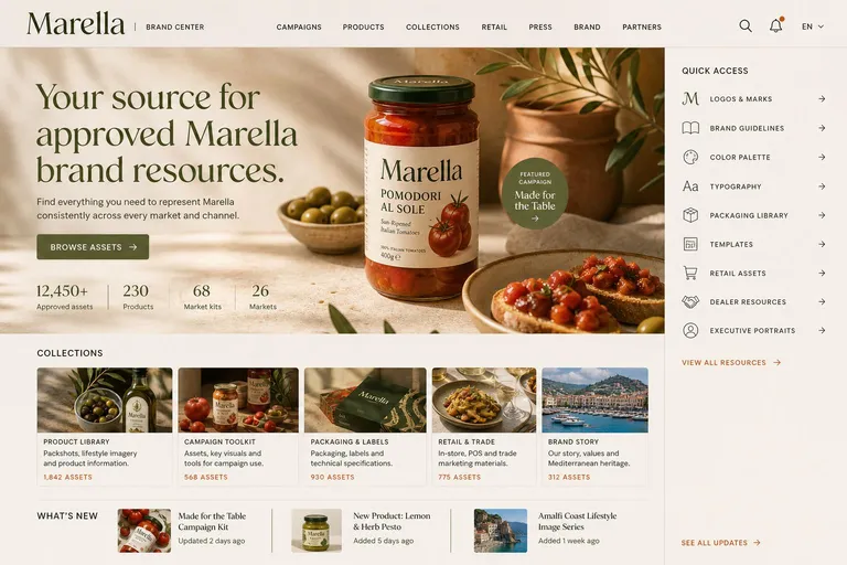
That is the standard to hold a brand center to. A reader who knows the sector should be able to name the brand from the layout alone.
Two more notes on identity. First, host it on your own domain. A brand center at brand.yourcompany.com is part of the brand, one at yourcompany.vendor.com is part of the vendor's. This is standard practice at the top end: brand.uber.com resolves to Uber's asset platform, and Mozilla's long-standing mozilla.design now redirects to brand.mozilla.com. Second, if you run more than one brand, decide early whether they share one brand center with a brand switcher, as Mozilla does with an all-brands index, or get separate portals. Retrofitting a multi-brand structure onto a single-brand information architecture is expensive to do later.
Search, and the metadata that makes it work
Once a brand center passes a few hundred assets, navigation stops scaling and search becomes the primary interface for anyone who has visited before. Designing search means designing three things.
The query box. Persistent, in the header, on every page including the homepage. Wide enough to show a real query. With autocomplete that suggests collections and asset types, not just raw strings.
What happens with zero results. The single highest-value screen in the whole portal, and usually the one nobody designed. A blank "No results for encanto ss26" is where a partner gives up and emails you. It should instead offer the closest matches, the collections that were searched, a spelling suggestion, and a one-click way to request the asset. Then it should log the query. The zero-result log is a direct list of what the brand center is missing, written by the people who needed it.
The index behind it. Search is only as good as what the assets carry. Filenames and folder paths are not enough, and this is the point at which brand center design becomes metadata design. The fields worth requiring in a partner-facing portal are fewer than in a full DAM schema:
- Asset type, from a controlled vocabulary, not free text. Six to twelve values.
- Market and language, because this is the most common filter a partner applies and the most common reason a download is wrong.
- Campaign or season, which is how marketing people actually think about time.
- Product or product line, if you sell products. This is the field that most often has to come from an existing system rather than be typed.
- Usage rights and expiry, covered in the next section.
- Status, meaning approved, superseded or retired. Non-negotiable.
Keep the required set small. Every mandatory field slows down ingestion, and a schema nobody completes is worse than a smaller one everybody does. Our DAM metadata best practices guide goes deeper on choosing fields, and the taxonomy guide covers the vocabulary work underneath them.
Two modern capabilities change what is reasonable to expect here. Semantic search lets a partner type "woman running at sunrise on a coast road" and reach the right shot without anyone having tagged those words, and visual search lets them paste an image they have seen and find the approved version of it. Both matter more in a brand center than in an internal DAM, precisely because external users do not know your vocabulary and will never learn it. Neither removes the need for structured fields, because market, rights and status are facts about an asset that no model can infer from its pixels. See how search works in Freedam for the mechanics.
Rights, versions and the things you cannot get wrong
A brand center distributes assets to people you do not employ. That makes rights a design requirement, not something to leave to the terms of use.
Carry the rights in the file, not only in the database. The IPTC Photo Metadata Standard, currently version 2025.1, defines the fields that travel inside the image itself: Creator, Credit Line, Copyright Notice, Rights Usage Terms, Web Statement of Rights and Licensor. The 2025.1 revision added properties describing AI generation, including the system used and the prompt information, which is becoming a question that partners and publishers ask. An asset downloaded from your brand center and forwarded twice should still be able to answer who made it and on what terms. That only works if the metadata is embedded on export.
Surface rights before the download, not after. Usage rights shown on the asset page, in plain language, with the expiry date where one exists. "Cleared for digital and print in EU markets until 31 March 2027" prevents more misuse than a clause in a terms page nobody opens.
Expire assets automatically. Talent and stock licences end. A brand center that keeps serving an image whose model release has lapsed is distributing an unlicensed image to every market at once, and usually nobody notices until someone complains. Expiry has to be a property of the asset that the portal enforces, not a reminder in someone's calendar. This is also why embargo handling matters: an unreleased campaign visible a day early to one partner is a leak.
Retire old marks visibly. Version control in a brand center is not only about keeping history. It is about making the superseded version unavailable and saying so. When a logo changes, the old file should stop downloading and its page should explain what replaced it and by when partners must switch. Leaving the old mark quietly downloadable is the most common single cause of a brand center that produces off-brand output.
Keep the audit trail. Who downloaded what, when, from which tier. This is what turns "we think partners are using the current kit" into a number, and it is what legal will ask for on the day something goes wrong. Our rights and compliance and governance pages cover how this is enforced in practice, and the guide on image rights in shared drives explains why a folder-based approach cannot do it.
Give people the file they actually need
A large fraction of brand center failures are not findability failures. The person found the asset and still could not use it, because the only thing offered was a 340 MB layered TIFF or a 5000-pixel PNG for a slide.
Design the download, not just the asset:
- Logos in vector and raster. SVG and EPS for anyone reproducing the mark, plus PNG at two or three sizes with transparency, plus the inverse and monochrome variants. Zip the set. Most logo requests you receive today are requests for a set, not a file.
- Named presets, not pixel dimensions. "Instagram post", "email header", "A4 print" and "presentation" get chosen correctly by non-designers. "2048 x 2048, 300 dpi, CMYK" does not.
- Generate renditions on demand. Pre-generating every crop of every asset is how libraries become unmaintainable. Deriving them from the master at download time keeps one source of truth and means a re-crop of the master updates everything downstream.
- Make bulk download work properly. A partner taking a full market kit should get one archive with a sensible folder structure inside it, not forty individual clicks.
- Answer the font question explicitly. This is the most common gap in brand centers. Either the licence permits redistribution to partners and you host the files with the licence terms attached, or it does not and you say so explicitly with a purchase link and an approved fallback. Silence here guarantees somebody substitutes Arial.
Accessibility and performance are part of the design
A brand center is a public website with large images and an external audience, which means two minimum standards apply that internal tools often skip.
Contrast. WCAG 2.2 Success Criterion 1.4.3, Level AA, requires a contrast ratio of at least 4.5:1 for normal text and 3:1 for large text, where large means 18 point, or 14 point bold. Brand palettes very often fail this, particularly pale accent colours used for links and small type on tinted surfaces. The fix is not to change the brand colour, it is to assign roles: keep the accent for large type and surfaces, and use a compliant pair for body copy. Public-sector and enterprise partners increasingly require this in procurement, so it is worth resolving before the portal ships rather than after a complaint.
Load time. Brand center homepages are image-heavy by nature, and the hero image is almost always the Largest Contentful Paint element. Google's threshold for a good LCP is 2.5 seconds at the 75th percentile of loads. A 4 MB uncompressed hero JPEG will not meet it on a partner's connection in a market with slower mobile networks, which is exactly the audience a global brand center is built to serve. Serve modern formats, size the image to the viewport, preload the hero, and lazy-load everything below the fold. This matters commercially too, because the brand center is a page you want indexed for your own brand name, and it is often the first result a journalist finds.
Governance: what the brand center looks like in a year
Every brand center looks good on launch day. The design question that actually determines success is what it looks like in eighteen months, and the answer is decided by three choices.
Curate with live views, not manual copies. If publishing to the brand center means someone exports files and uploads them again, the portal will be out of date within a quarter, because that person will get busy. The durable pattern is that the brand center is a saved view over the library, defined by rules such as "approved, not expired, tagged retail, market EU", so an asset that meets the rule appears without anyone doing anything and an asset that expires disappears the same way. This is the difference between a brand center and a folder of ZIP files, and it matters more than any visual decision in this guide.
Give it one named owner. Not a committee. One person who is accountable for what is on the front page, with a monthly slot to review the zero-result log, the top downloads, and anything that has not been touched in a year. Brand centers rarely fail all at once. They go out of date because nobody reviewed them for twelve months in a row.
Schedule the removals. Adding is easy and everyone volunteers. Removing is the work nobody does, and it is what keeps the library trustworthy. Retire superseded logos, expired photography, last year's templates and dead campaigns on a calendar, not on request.
Our DAM implementation guide covers the rollout sequence in more detail, and the requirements checklist is useful if you are still choosing the platform underneath.
How to tell whether it is working
Five numbers, reviewed monthly, tell you more than any survey.
- Downloads per active partner. Not total downloads, which grow with the audience. Per-partner usage tells you whether the portal became a habit.
- Zero-result rate. The share of searches returning nothing. Anything above a few percent is a content gap or a vocabulary gap, and the log tells you which.
- Time to first download for a new visitor. If it takes more than a minute, the homepage is not routing people correctly.
- Inbound asset requests. The email volume the brand center was built to eliminate. This is the honest measure, and it should fall. If it does not, ask the last five people who emailed what they searched for first.
- Share of the library that has been downloaded at all in the last year. Assets nobody downloads are not free to keep, because they appear in search results and make the useful ones harder to see.
Set a baseline before launch on numbers 4 and 5, because they are the two you cannot reconstruct afterwards. Analytics should be part of the portal rather than a separate exercise.
A launch checklist
- The homepage answers "what is this and where is the logo?" without scrolling.
- The logo set is in the open tier, in vector and raster, zipped, with the inverse and mono variants.
- Search is in the header on every page, and the zero-result screen is designed and logged.
- Collections are named after what the visitor came to do, there are no more than six, and none is called Other.
- Quick access holds the five permanent entries and nothing seasonal.
- What's new shows something from the last month, and will keep doing so without manual work.
- Every asset carries status, market, rights and expiry, and expiry is enforced by the system.
- IPTC rights fields are embedded on export, not only stored in the database.
- The retired logo cannot be downloaded, and its page explains what replaced it.
- Body text meets 4.5:1 contrast against its actual background, checked on the real palette.
- The hero image is under a hundred kilobytes in a modern format, and the page hits LCP under 2.5 seconds on mobile.
- One named person owns the front page, with a recurring monthly review in the calendar.
- Cover the logo. A person in your sector can still tell it is yours.
See yours before you design it
The fastest way to make these decisions concrete is to look at a brand center in your own identity rather than at someone else's. Our free brand center generator reads your public homepage, profiles the brand from your logo, palette, typography and imagery, and renders a brand center homepage designed around it, using the six-region structure in this guide. It takes about a minute, needs no account, and the result is a design direction you can put in front of stakeholders.
If you would rather browse first, the brand center inspiration gallery holds thirty-five worked examples across sectors, and the brand portal solution page covers what the live version looks like on Freedam, with brand asset management and localised campaigns for the parts that come after launch. Other free tools are listed on the tools page.