
Branding
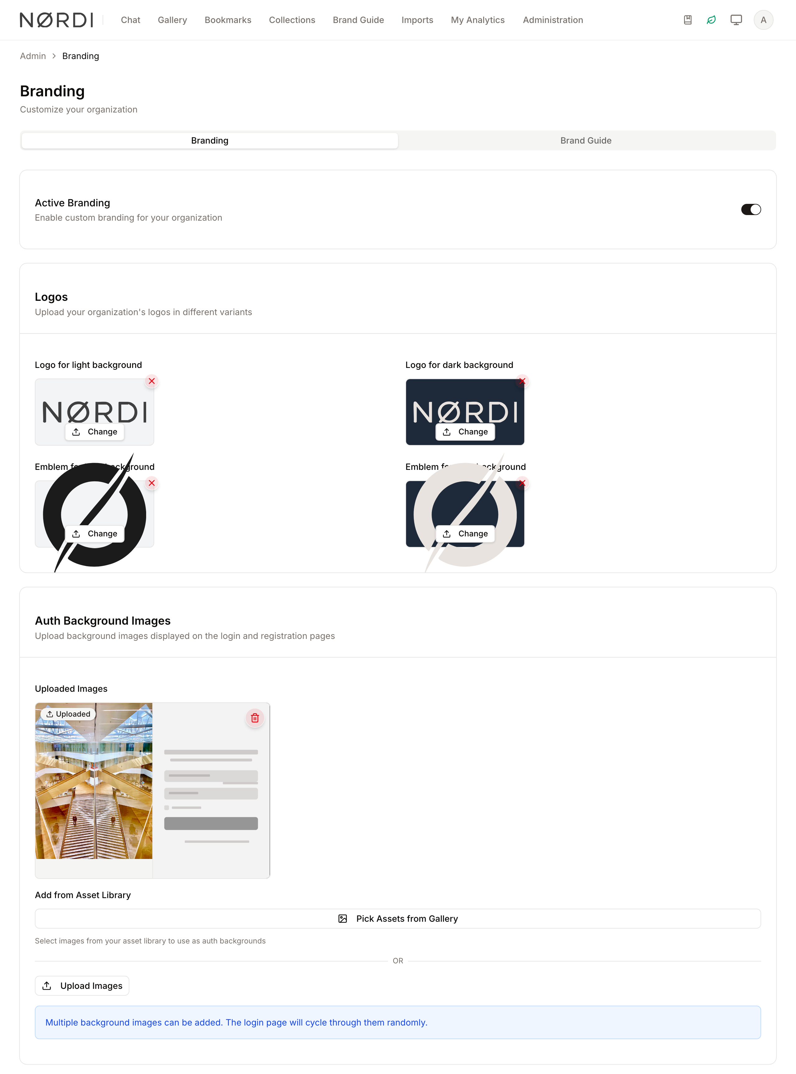
The Branding feature allows administrators to tailor the visual identity of the Freedam web app. By uploading custom logos and background images, you ensure that the platform aligns with your organization's corporate identity across all user touchpoints, including the login and registration pages.
Beyond simple interface customization, this module includes a robust Brand Guide tool. This serves as a central repository for your organization's design standards, housing approved logos, emblems, color palettes, and typography rules for internal and external stakeholders.
Page Overview
- Purpose: To manage the application's visual theme and document brand standards.
- When to use it: Use this page when setting up a new environment, updating corporate identity, or providing a reference guide for design assets.
- What you can do here:
- Toggle custom branding on or off globally.
- Upload logos for light and dark interface modes.
- Set up rotating background images for the login screen.
- Define official color palettes with HEX and PMS codes.
- Upload and preview corporate typefaces.
- Create detailed usage guidelines for brand assets.
Page Layout
- Top bar: Displays the "Branding Management" title and a brief description of the page's purpose.
- Tabs: Switch between the Branding tab (for application interface settings) and the Brand Guide tab (for design documentation).
- Main area: Contains cards for specific settings like Logos, Authentication Backgrounds, and Color Palettes.
- Dialogs/Sheets: Pop-up windows used for adding new assets, editing typeface details, or designing "Exclusion Zones" for logos.
Main Features
Interface Customization
- What it's for: Applying your organization's logos and backgrounds to the Freedam app.
- Typical use: Uploading a high-resolution PNG of your company logo to replace the default app icon.
- Result: Your logo appears in the navigation bar and on the login screen.
Brand Guide Management
- What it's for: Creating a digital manual for brand assets.
- Typical use: Adding a "Primary Logo" variant with specific instructions on how much clear space (Exclusion Zone) must surround it.
- Result: Users can view and download approved assets directly from the main menu if enabled.
Color Palette Editor
- What it's for: Defining official brand colors.
- Typical use: Entering a HEX code for "Corporate Blue" and adding its corresponding PMS (Pantone) code for print reference.
- Result: A visual swatch library that provides RGB and CMYK values for designers.
Typography & Fonts
- What it's for: Documenting approved typefaces.
- Typical use: Uploading a
.woff2font file and setting custom preview text to show how the font looks in action. - Result: A typography section in the Brand Guide showing font previews and download links.
Detailed Feature Documentation
Logo Management
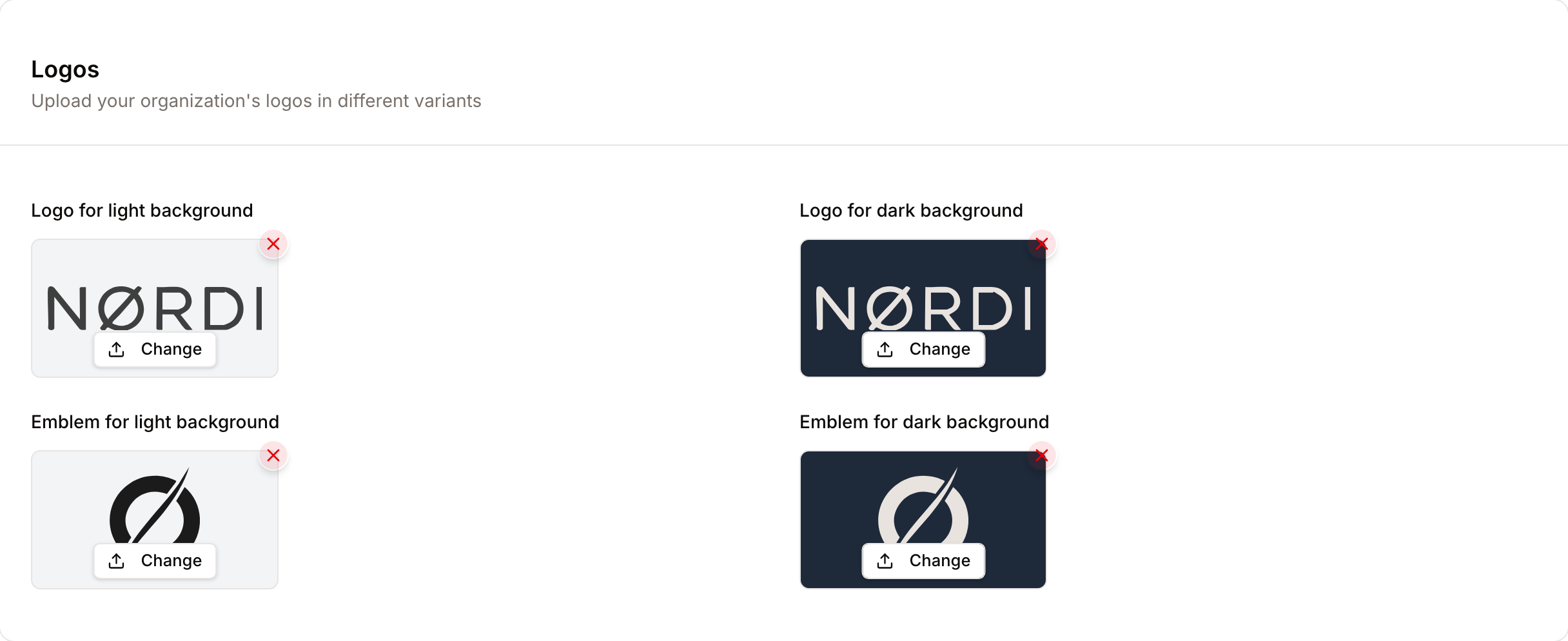
- Purpose: To define the logos used in the app's header and sidebar.
- Where to find it: In the Branding tab, under the Logos card.
- What you'll see: Four upload slots for Extended Light, Extended Dark, Collapsed Light, and Collapsed Dark variants.
How to use it:
- Locate the logo variant you wish to update (e.g., Extended Light).
- Click the Upload button (or Change if a logo already exists).
- Select an image file from your computer.
- To remove a logo, click the X icon on the top-right of the image preview.
Authentication Backgrounds
- Purpose: To set the images seen by users on the login and registration screens.
- Where to find it: In the Branding tab, under Authentication Background Images.
- What you'll see: A gallery of currently active backgrounds and buttons to add more.
How to use it:
- To use existing assets, click Pick Assets from Gallery to open the asset library.
- To upload new files, click Upload Background Images.
- To remove an image, click the Trash icon on the image card and confirm in the dialog.
- Note: If multiple images are present, the system randomly selects one for each page load.
Color Palette Configuration
- Purpose: To store and display official brand colors.
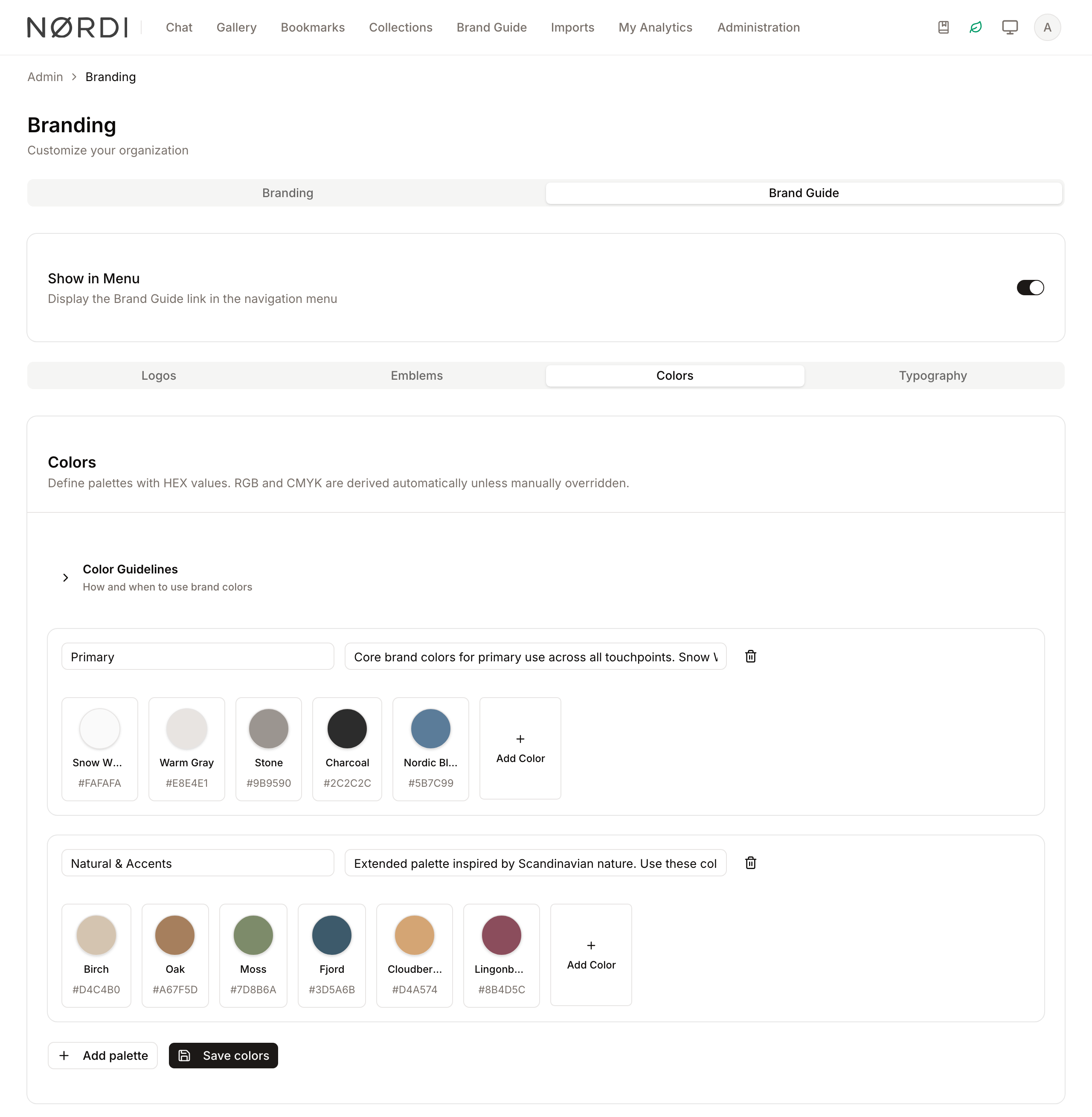
- Where to find it: In the Brand Guide tab, under the Colors section.
- What you'll see: A list of palettes containing color swatches.
How to use it:
- Click Add Palette to create a new group.
- Type a name in the Palette name field.
- Click Add color to create a new swatch.
- Click the swatch to open the editor; here you can enter the Name, HEX, and PMS code.
- Toggle Manual under the CMYK section if you wish to override the automatically calculated print values.
Complete Workflows
Workflow: Enabling the Brand Guide for Users
- Goal: Make the Brand Guide visible in the main application menu for all users.
- Prerequisites: The "Brand Guide" feature must be enabled for your account.
Steps:
- Navigate to the Brand Guide tab.
- Locate the card labeled Show Brand Guide in Menu.
- Click the Switch control to the "On" position.
- The system will display a success message.
- Expected result: A "Brand Guide" link appears in the main navigation menu for all users.
Workflow: Adding a Logo Variant to the Brand Guide
- Goal: Add a specific logo variant (like a monochrome version) with usage rules.
- Prerequisites: Have the logo file ready for upload.
Steps:
- In the Brand Guide tab, click Add Logo.
- In the Name field, type a descriptive name (e.g., "Monochrome Logo").
- Select a Variant from the dropdown (e.g., "Black").
- Check the boxes under Recommended backgrounds to indicate where this logo should be used.
- Click Add files to upload the actual logo file.
- Click Create.
- Expected result: The new logo variant appears in the Brand Guide list.
What you can customize
The Branding page is the single source of truth for your workspace's look and feel. Everything saved here updates the running application in real time - users see new logos, colors, and backgrounds on their very next page load without any need to refresh the browser or wait for a build.
The four logo slots (Extended Light, Extended Dark, Collapsed Light, Collapsed Dark) cover every place a logo appears - the full-width sidebar, the compact/collapsed sidebar, the login screen, and dark-mode views. Accepted formats are SVG, PNG, JPG, GIF, and WebP, up to 5 MB per file.
Authentication backgrounds can be added two ways: by picking existing images from your asset library (which automatically serve at the best resolution for each visitor's screen, from mobile up to 4K) or by uploading new JPG, PNG, or WebP files up to 5 MB each. When more than one background is configured, a different image is shown on each visit to the login screen.
The Brand Guide tab is a premium module. If your plan does not include it, you will see an upgrade notice instead of the configuration cards. When enabled, you can document logos and emblems, rich color palettes, and approved typefaces - all of which are exposed as a read-only reference page for your team via the main menu.
Colors, typography, and brand assets
The Color Palette editor stores a name, HEX value, and optional PMS (Pantone) reference for each swatch, and automatically derives the matching CMYK values for print. Designers can flip the Manual toggle if they need to override the computed CMYK with a custom mix.
Each brand asset (logo variant, emblem, monochrome version, etc.) can carry its own exclusion zone, minimum and maximum size recommendations, and a list of recommended background tones (light, dark, color, photo). You can also attach usage examples tagged as "correct", "incorrect", or "neutral" with captions, so the Brand Guide doubles as a do/don't reference for external agencies.
Typefaces uploaded to the Brand Guide support standard WOFF2 font files and a custom preview sentence so each face renders with a sample that reflects your tone of voice.
Who can use it
Only people whose role includes the Manage branding permission can open, edit, or save anything on this page. Typically this is reserved for workspace administrators or designated brand stewards. Everyone else in the workspace simply sees the results: updated logos in the sidebar, branded login screen, and - if the Brand Guide is turned on - a read-only guide in the main menu.
Tips and Best Practices
- Logo Contrast: Always upload both "Light" and "Dark" logo variants. The "Light" variant is used on dark backgrounds, and the "Dark" variant is used on light backgrounds.
- Exclusion Zones: Use the Exclusion Zone Designer in the Brand Guide to visually define the "safe area" around your logo. This helps external vendors maintain your brand integrity.
- Background Variety: Upload 3–5 different authentication backgrounds to keep the login experience feeling fresh for users.
- File Size: Keep individual logo and background uploads under 5 MB. Larger files will be rejected at upload.
Good to know
- Changes saved here take effect immediately for everyone in the workspace - there is no separate publish step.
- Turning the Enable Custom Branding switch off hides your uploaded logos and backgrounds without deleting them, so you can revert to defaults temporarily for maintenance or demos and then switch the customisations back on.
- Uploaded logos and backgrounds live in your own workspace's storage, separate from your asset library, so they do not count against asset quotas or appear in search results.
Troubleshooting
Issue: Logo looks blurry or distorted
- Symptoms: The uploaded logo appears pixelated in the top bar.
- Cause: The uploaded file resolution is too low or the aspect ratio is unusual.
- Fix: Upload a high-resolution PNG or SVG file. Ensure the "Collapsed" variants are square or circular.
- Prevention: Use the "Recommended backgrounds" preview in the Brand Guide to test visibility before applying globally.
Issue: Brand Guide tab is locked
- Symptoms: A "Feature Upgrade Notice" is displayed instead of the Brand Guide settings.
- Cause: Your current subscription plan does not include the Brand Guide module.
- Fix: Contact your account manager to upgrade your plan.
Issue: Background image not appearing on login
- Symptoms: The login page shows a default gray background.
- Cause: The Enable Custom Branding switch is turned off.
- Fix: Go to the Branding tab and ensure the Enable Custom Branding switch is toggled to the right (active).