
Dashboard
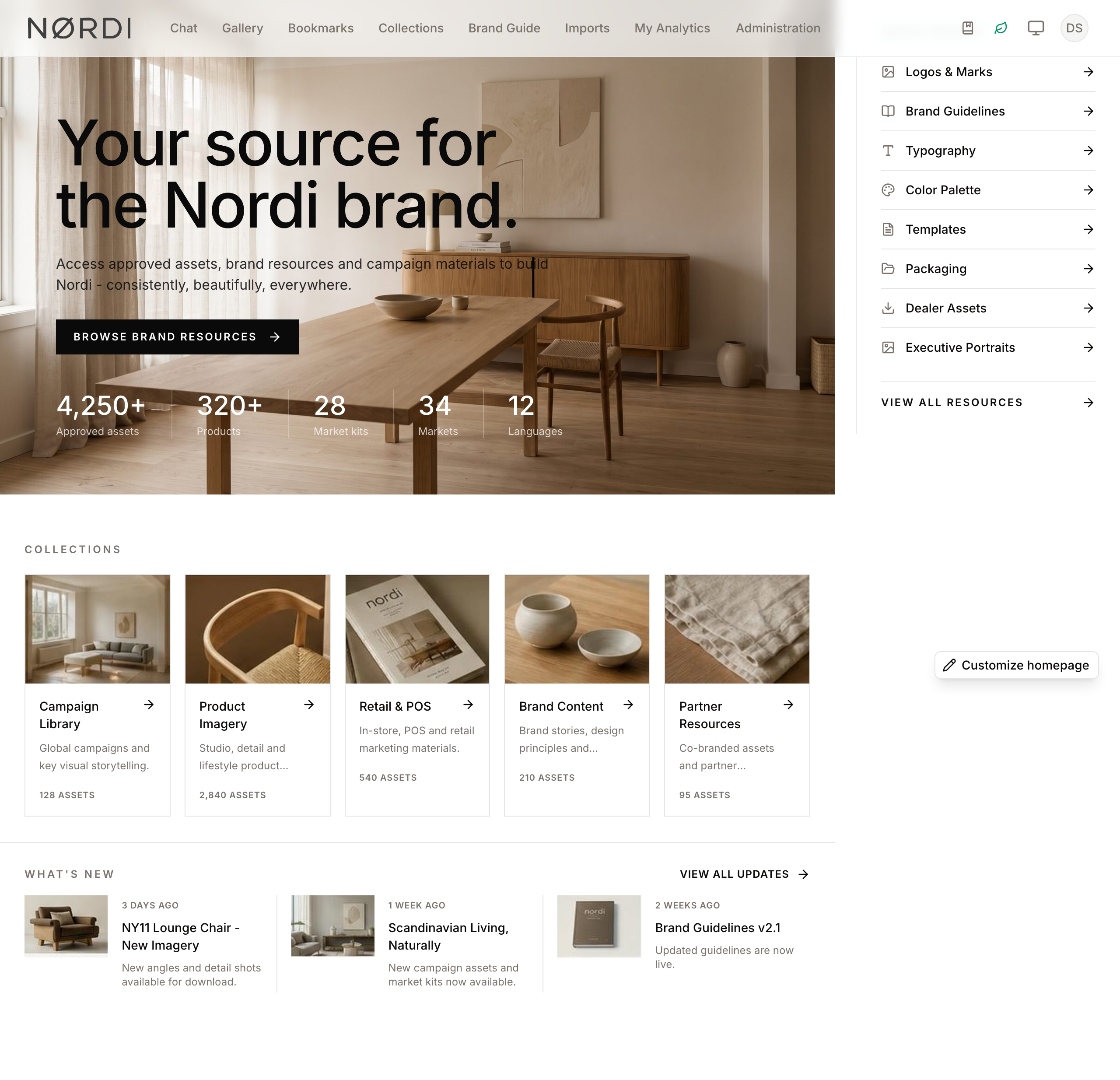
The Dashboard serves as the central landing hub for your Digital Asset Management experience. It provides a high-level overview of your library, featuring quick access to recent uploads, popular assets, and curated collections.
For administrators, the Dashboard is a fully customizable canvas. You can arrange, resize, and configure various "blocks" to tailor the experience for your team, ensuring that the most important brand assets and news are always front and center. Changes are made in a dedicated homepage editor that saves your work as a draft: the live page only changes when you click Publish.
Page Overview
- Purpose: To provide a personalized and curated entry point into the asset library.
- When to use it: Use the Dashboard to quickly resume work on recent assets, browse featured collections, or view brand guidelines.
- What you can do here:
- View recently ingested assets and personal collections.
- Explore popular assets based on download trends.
- Access brand guides, logos, and color palettes.
- Customize the layout and appearance of the page (if permitted), with drafts, publishing, and version history.
- Search the library directly from a dedicated search block.
Page Layout
- Viewing: The published homepage, rendered for every visitor according to their permissions. People with the Manage dashboard layout and blocks permission see a floating Customize homepage button in the bottom-right corner. The button is not shown on small screens.
- Editor: Clicking Customize homepage opens the homepage editor. Its top bar contains Insert (add a block), undo/redo, Page (page-wide settings), version history, a desktop/tablet/mobile preview switch, a save indicator (Saved, Unsaved, Saving…), Preview, and Publish. Preview saves the draft and closes the editor so you can see the page as visitors will. The menu next to Publish holds View version history.
- Inspector panels: Selecting a block opens a side panel with its content and presentation settings, using visual controls - small schematic previews for layout choices, an alignment grid for text placement, and sliders for spacing and opacity - so every option shows its effect at a glance.
Main Features
Content Blocks
- What it's for: Displaying specific types of data like "Recent Assets," "News," or "Video Grids."
- Typical use: Adding a "Recent Assets" block so users can see the latest uploads immediately upon login.
- Result: A new widget appears on the grid showing live data from your library.
Available block types include: Recent Assets (the newest uploads, defaulting to 24 tiles), My Collections (your own personal collections, defaulting to 8), Featured Collections (a curated set picked by an admin), Popular Assets (defaulting to 12, ranked by total download counts pulled from analytics), Brand Guide (logo and color swatches from the Brand Guide), and Video Grid (specific videos hand-picked by admins, automatically hidden from viewers who don't have permission to see them). Each tile only shows data the current user is allowed to see, so different visitors get a personalised dashboard from the same layout.
You can also add clickable image blocks: Image Banner and Link Banner (a single image that links somewhere), and Category Card (an image with a list of links beneath it). Any of these can point directly to a pre-filtered gallery view - see Linking a Banner to a Filtered Gallery View below.
For editorial, brand-center style homepages there are five composite blocks: Editorial Hero (a full-bleed or split brand story with calls to action, which can extend behind the menu bar), Collection Showcase (editorial collection cards), Resource Links (an ordered quick-access rail or grid), Updates Feed (a stable feed of recent assets or manual updates), and Metrics Strip (a restrained row of counts and figures).
Drafts, Publishing, and Version History
- What it's for: Editing safely without changing what your team sees.
- Typical use: Reworking the homepage over several sessions, then publishing once it is ready.
- Result: Your edits autosave as a draft. Clicking Publish replaces the live page in one step and records an immutable version you can restore later from the version history panel.
If two administrators edit at the same time, the editor detects the conflict instead of silently overwriting: the save indicator shows Update conflict, Publish is disabled, and publishing shows "Another editor changed the homepage while you were publishing. Reopen the editor to review the newer revision." Restoring an old version only changes your draft: the live homepage stays the same until you publish.
Drag-and-Drop Layout
- What it's for: Organizing the visual hierarchy of the page.
- Typical use: Moving the "Search" block to the top of the page and resizing a hero to span the full width.
- Result: Blocks snap to a grid. In the editor, dragging and resizing are available in the desktop preview; tablet and mobile previews show how the layout stacks on smaller screens.
Visual Customization
- What it's for: Matching the dashboard's look to your brand's aesthetic.
- Typical use: Choosing a wide canvas, adjusting spacing between blocks, or letting the first block run behind the menu bar.
- Result: The Page settings control canvas width, edge padding, column and row gaps, corner radius, borders, and the menu bar treatment for the whole page.
Detailed Feature Documentation
Block Picker
- Purpose: To select and add new functional widgets to the dashboard.
- Where to find it: Click Customize homepage, then click Insert in the editor top bar.
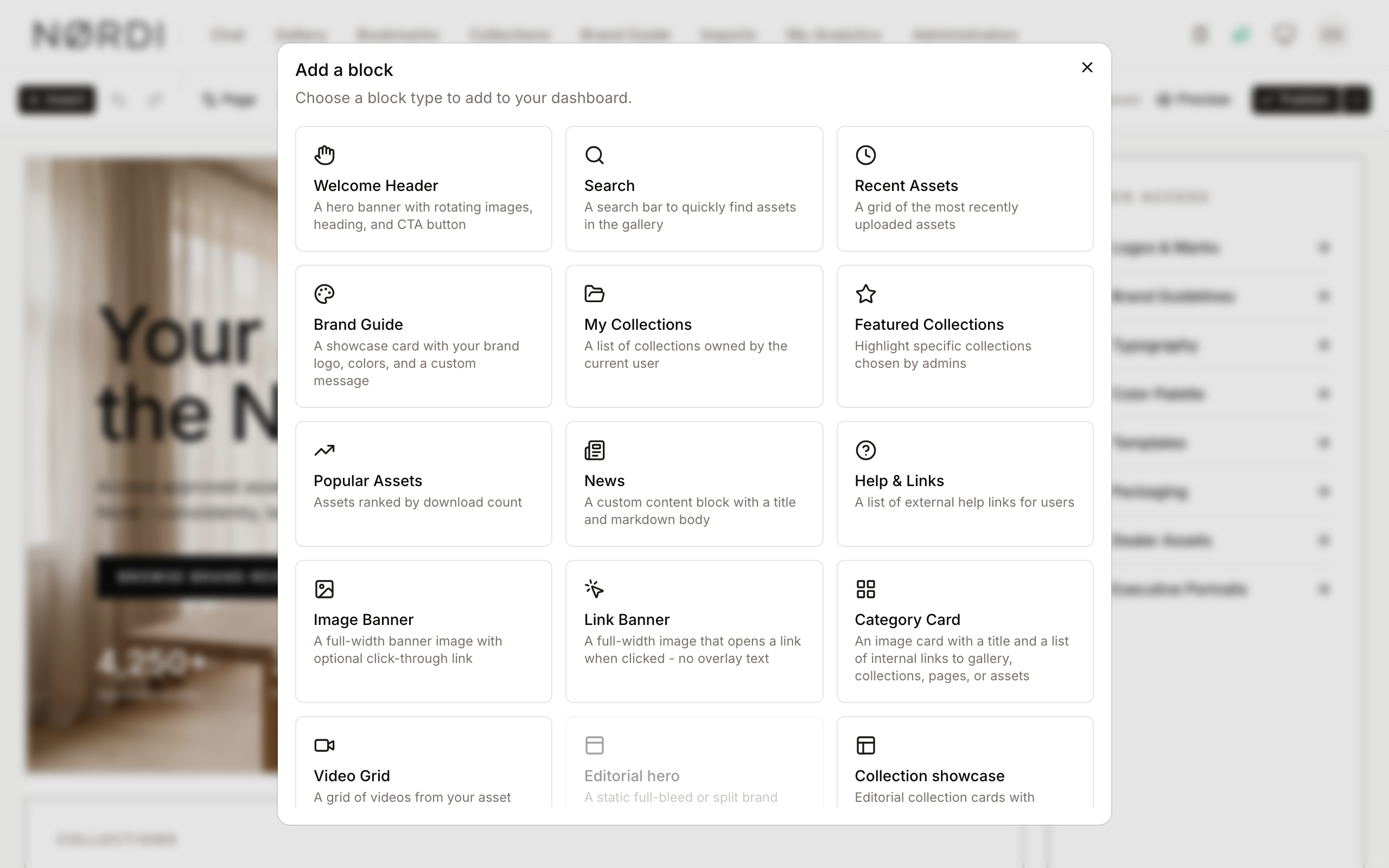
- What you'll see: A window opens listing available blocks such as Editorial Hero, Recent Assets, Brand Guide, and Video Grid.
How to use it:
- Click Customize homepage to open the editor.
- Click Insert.
- Browse the list of available blocks. Note that some blocks may be disabled if the maximum number of instances has already been reached.
- Click a block type to add it to the bottom of your grid and open its settings panel.
Block Configuration
- Purpose: To customize the content and behavior of a specific block.
- Where to find it: In the editor, click a block to open its settings panel. All block types are edited inline in this panel while the page updates live beside it.
- What you'll see: Fields specific to that block type (e.g., choosing which collections to feature or selecting an image for a banner).
How to use it:
- Open the editor with Customize homepage.
- Click the block you wish to change.
- Adjust the fields in the side panel; the canvas reflects every change immediately.
- For blocks requiring images, use the provided selection tool to pick an asset from the gallery.
- Changes are saved to your draft automatically; publish when you are ready.
Linking a Banner to a Filtered Gallery View
- Purpose: To send users straight to a pre-filtered slice of the gallery - for example, a "Product Images" banner that opens only product images, or an "Infographics" banner that opens only infographics.
- Where to find it: In the configuration of an Image Banner, Link Banner, or Category Card block. Image and Link banners have an Or link to a gallery filter section; on a Category Card, set a link's type to Gallery filter.
- What you'll see: A Choose filter button. Clicking it opens the same filter builder used in the gallery, where you combine one or more conditions (asset type, collection, colour, people, and any other available field).
How to use it:
- Add or edit an Image Banner, Link Banner, or Category Card block.
- For a Category Card link, pick Gallery filter as the link type; for an Image or Link Banner, find the Or link to a gallery filter section.
- Click Choose filter and build your conditions (e.g. Asset Type is one of Infographic). You can select several values at once to combine them - for instance, every image type that makes up "Product Images".
- Click Apply filter. The banner now stores the filter and links to the matching gallery view - no manual URLs required.
- Use Edit filter to change it later, or Clear to remove it.
To link to a single collection instead of a filter, click Link to a collection next to any link field (banners, category card links, hero calls to action, resource links, updates and view-all links) and pick the collection - the link is built for you, no URL required.
- Expected result: Clicking the banner opens the gallery already filtered to the conditions you chose.
Page Settings
- Purpose: To adjust the global composition and styling of the homepage.
- Where to find it: In the editor top bar, click Page.
- What you'll see: A panel with Canvas, Surfaces, and Navigation sections.
How to use it:
- Click Customize homepage, then Page.
- Under Canvas, choose the page width (contained, wide, or full bleed), the edge padding, and the column and row gaps.
- Under Surfaces, set the corner radius and optional subtle border or shadow applied to every block.
- Under Navigation, choose whether the menu bar stays solid or overlays the first row. The overlay treatment requires a single full-width, overlay-capable block (such as an Editorial Hero) in the first row.
Version History
- Purpose: To review and restore previously published homepages.
- Where to find it: The history icon in the editor top bar.
- What you'll see: A list of published versions with their labels, dates, and authors.
How to use it:
- Open the editor and click the history icon.
- Click Restore next to a version. It becomes your current draft; the live page does not change.
- Review the restored draft and click Publish to make it live.
Complete Workflows
Workflow: Creating a Curated Landing Page
- Goal: Set up a professional landing page with a hero and featured collections.
- Prerequisites: Dashboard authoring rights (granted to workspace administrators).
Steps:
- Click Customize homepage.
- Click Insert and select Editorial Hero.
- In the block panel, set the heading, supporting text, call to action, and background image.
- Click Insert again and select Collection Showcase.
- In the block panel, select the specific collections you want to highlight.
- Drag the blocks to position the hero at the top and the collections below it.
- Click Publish.
- Expected result: The homepage updates for all users to show the new hero and curated collections.
Workflow: Updating Brand Colors on the Dashboard
- Goal: Ensure the Dashboard reflects the latest brand identity.
- Prerequisites: Brand Guide data must be populated in the system.
Steps:
- Click Customize homepage.
- Click Insert and select Brand Guide.
- Click the block and use its settings panel to configure how many colors or which logos to display.
- Resize the block by dragging the bottom-right corner to ensure all colors are visible.
- Click Publish.
- Expected result: A visual summary of your brand (logo and color swatches) appears on the dashboard.
Workflow: Add a Banner that Opens a Filtered Category
- Goal: Give users a banner per content category (e.g. Product Images, Infographics, Videos) that links straight to the matching, pre-filtered gallery.
- Prerequisites: Dashboard authoring rights.
Steps:
- Click Customize homepage, then Insert, and choose Image Banner (or Category Card for a single tile with several category links).
- Open the block's settings and pick a banner image.
- In Or link to a gallery filter (Image/Link Banner) - or by setting a link's type to Gallery filter (Category Card) - click Choose filter.
- Build the filter for that category and click Apply filter.
- Repeat for each category you want to feature, then click Publish.
- Expected result: Each banner opens the gallery filtered to its category, giving users a simple, visual way to browse by content type.
Tips and Best Practices
- Hierarchy Matters: Place the Editorial Hero, Search, or Welcome Header blocks at the very top for the best user experience.
- Mobile Consideration: The dashboard is responsive. Blocks will stack vertically on smaller screens; use the editor's tablet and mobile previews to check the reading order.
- Instance Limits: Some blocks, like "Recent Assets," may have a limit on how many times they can be added to prevent clutter.
- Publish deliberately: Your edits autosave as a draft, so you can leave and come back at any time. The live page only changes when you click Publish, and every publication is kept in the version history.
Troubleshooting
Issue: Dashboard appears empty
- Symptoms: You see a message saying "Your Dashboard is Empty."
- Cause: No blocks have been added to the layout yet, or you do not have permission to view the configured blocks.
- Fix: If you are an admin, click Customize homepage and add at least one block, then publish.
- Prevention: Ensure at least one "Recent Assets" or "Search" block is always present for general users.
Issue: Unable to save or publish changes
- Symptoms: The save indicator shows "Save failed" or "Update conflict," or Publish stays disabled.
- Cause: Network connectivity issues, insufficient administrative permissions, or another administrator saved a newer revision while you were editing.
- Fix: For a conflict, exit the editor and reopen it to load the newer revision. Otherwise refresh the page and try again; if the issue persists, ask your system administrator to verify your "Admin Dashboard" permissions.
Issue: Image not appearing in Banner
- Symptoms: A banner block shows a placeholder or is blank.
- Cause: The selected asset may have been deleted or moved.
- Fix: Open the block configuration, remove the old selection, and pick a new asset from the gallery.
When the homepage is a custom page
The dashboard can show a custom page instead of the block layout. When your workspace's Dashboard page space contains published top-level pages, and no block layout has been set as the homepage, visitors see those pages on the dashboard, with page navigation when there are several. In that case there is no Customize homepage button: edit the pages in Page Spaces and Custom Pages instead.
People who aren't allowed to view pages always see the block layout.