
Analytics
The Analytics dashboard provides a comprehensive overview of your personal interaction with digital assets. It is designed for users who need to track their productivity, revisit recent searches, or identify which assets they interact with most frequently.
By monitoring these metrics, you can gain insights into your workflow patterns and quickly jump back into active projects through your search and view history.

Page Overview
- Purpose: To provide a centralized view of your personal activity and asset engagement.
- When to use it: Use this page to review your total downloads, analyze your search behavior over time, or find assets you recently viewed.
- What you can do here:
- Filter all dashboard data by specific time periods.
- View high-level totals for views, downloads, and searches.
- Visualize activity intensity using a daily heat map.
- Review and re-run recent search queries.
- Access your most frequently viewed assets directly.
Page Layout
- Top bar: Contains the page title ("My Analytics") and the period selection dropdown to filter the entire dashboard.
- Main area: A grid-based layout featuring statistical cards, an activity heat map, a list of recent searches, and a gallery of most-viewed assets.
- Activity Timeline: A line chart at the bottom of the page showing trends for views, downloads, and searches over the selected timeframe.
Main Features
Period Filtering
- What it's for: Restricting the data shown on the dashboard to a specific timeframe.
- Typical use: Changing the view from the "Last 7 days" to the "Last year" to see long-term trends.
- Result: All statistics, charts, and lists on the page refresh to reflect the chosen period.
Activity Heat Map
- What it's for: Visualizing daily engagement levels over the past year.
- Typical use: Identifying "bursts" of high activity or identifying gaps in platform usage.
- Result: A grid of colored squares appears; darker or warmer colors indicate days with higher activity counts.
Recent Searches List
- What it's for: Tracking your search history and the effectiveness of your queries.
- Typical use: Checking how many results a specific complex search returned or remembering a specific filter combination used earlier.
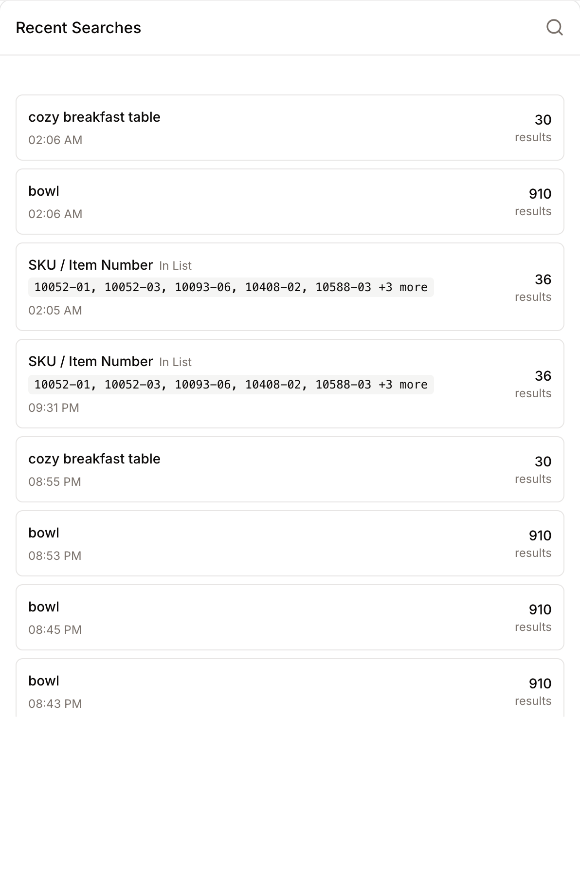
- Result: Displays a list of recent queries with translated filter badges (e.g., field names and values) and result counts.
Detailed Feature Documentation
Stats Overview
- Purpose: To give an immediate snapshot of your total platform engagement.
- Where to find it: At the top of the main content area, below the header.
- What you'll see: Four cards showing "Total Views", "Total Downloads", "Total Searches", and "Collections Created".
How to use it:
- Navigate to the My Analytics page.
- Observe the numbers in the four primary cards.
- Change the Select period dropdown in the top bar to see how these totals change over time.

Activity by Day (Heat Map)
- Purpose: To provide a GitHub-style visualization of your daily actions.
- Where to find it: The first large card below the Stats Overview.
- What you'll see: A grid where columns represent weeks and rows represent days of the week (Sunday to Saturday).
How to use it:
- Locate the Activity by Day section.
- Hover your mouse over any colored square in the grid.
- View the tooltip to see the exact date and the number of activities recorded for that day.
- Use the Legend at the bottom of the grid to understand the intensity levels (from "Less" to "More").
Recent Searches
- Purpose: To review the specific parameters of your past searches.
- Where to find it: In the left column of the two-column layout section.
- What you'll see: A list of search terms, often broken down into color-coded badges representing fields, operators, and values.
How to use it:
- Scroll to the Recent Searches card.
- Review the badges to see exactly which filters were applied (e.g., a green badge for a specific value).
- Note the results count on the right side of each entry to see how broad or narrow your search was.
- Check the timestamp below the search term to see when the query was performed.
Complete Workflows
Workflow: Analyzing Long-term Usage Trends
- Goal: Compare your asset engagement from the last week against your yearly average.
- Prerequisites: Existing account activity (views or downloads).
Steps:
- Click the Select period dropdown in the top right of the page.
- Select Last 7 days.
- Note the values in the Stats Overview and the peaks in the Activity Timeline chart.
- Click the Select period dropdown again and select Last year.
- Compare the Total Downloads and Total Views to see your long-term growth.
- Expected result: The dashboard updates instantly, showing a much denser Activity by Day grid and a more detailed Activity Timeline.
Workflow: Re-accessing Frequently Used Assets
- Goal: Quickly find and open an asset you have viewed multiple times recently.
- Prerequisites: You must have viewed at least one asset during the selected period.
Steps:
- Navigate to the Most Viewed Assets card.
- Browse the gallery of asset thumbnails.
- Click directly on an Asset Thumbnail.
- Expected result: You are redirected to the detailed view of that specific asset.
What's measured
Your personal Analytics dashboard summarises the actions that are automatically recorded as you work in the platform. The following activity counts toward your totals:
- Views - every time you open an asset detail page.
- Downloads - every time you download an original file or a rendition.
- Searches - every search query you run, together with the filters applied and how many results came back. This is what powers the Recent Searches list.
- Collections created - how many personal or shared collections you've started in the period.
- Most viewed assets - the assets you opened most often, filtered so that you only see items you still have permission to access. If an asset has been restricted, archived, or removed since you last viewed it, it simply drops out of the list.
Alongside these totals, the dashboard builds two other views from the same activity log: a daily heat map (one square per day) and a daily timeline that splits activity into views, downloads, and searches.
Period options
The Select period dropdown offers four presets: Last 7 days, Last 30 days, Last 90 days, and Last year. The default view is the last 30 days. All cards, charts, and lists respect the period you select.
How often the data refreshes
To keep the dashboard fast, the numbers you see are cached and refresh every few minutes. If you've just performed a view, download, or search and don't see it yet, wait a short moment and reload the page.
Who can see what
Your personal My Analytics page only shows your own activity - you can't see what other colleagues have done. Workspace administrators have a separate organisation-wide dashboard that rolls up activity across the whole workspace and surfaces AI-generated insights (such as trending searches or popular asset types); administrators can dismiss an insight once they've acted on it, and it won't reappear.
Tips and Best Practices
- Hover for Detail: In the Activity Timeline chart, hover over the data points to see a precise breakdown of Views, Downloads, and Searches for that specific date.
- Badge Colors: In Recent Searches, pay attention to badge colors: Blue typically represents a metadata field, while Green represents the specific value you searched for.
- Empty States: If you see "No activity in this period," try expanding your search by selecting "Last year" from the period dropdown.
- Most-viewed list seems short: The list only shows assets you can still access. If your permissions changed or an asset was archived, it won't count - this is by design so you never see dead links.
Troubleshooting
Issue: Dashboard shows "No assets found" or "No activity"
- Symptoms: The Most Viewed Assets gallery is empty or charts show zero data.
- Cause: The selected time period (e.g., "Last 7 days") may not contain any recorded actions.
- Fix: Change the Select period dropdown to a longer duration, such as Last 90 days or Last year.
- Prevention: Ensure you are logged in when browsing or downloading assets to ensure activity is tracked to your profile.
Issue: Search terms look like "Translating..."
- Symptoms: The Recent Searches list shows a loading message instead of filter badges.
- Cause: The system is currently processing the raw search query to display it in a user-friendly format.
- Fix: Wait a few seconds for the badges to appear. If it persists, refresh the page.
Issue: A recent action isn't showing up yet
- Symptoms: You just viewed or downloaded an asset but the totals haven't moved.
- Cause: Dashboard figures are cached and refresh every few minutes so the page can load quickly.
- Fix: Wait a couple of minutes and reload; the action will appear at the next refresh.