
Form Studio
Form Studio is a powerful administrative tool used to design the visual layout of metadata forms for your assets. It allows you to organize metadata fields into logical sections, choose column layouts, and define how users interact with data entry forms across different devices.
This feature is primarily for system administrators who need to tailor the user experience for specific asset types. By using Form Studio, you can ensure that the most important information is prominent and that complex metadata is organized into manageable, collapsible sections.
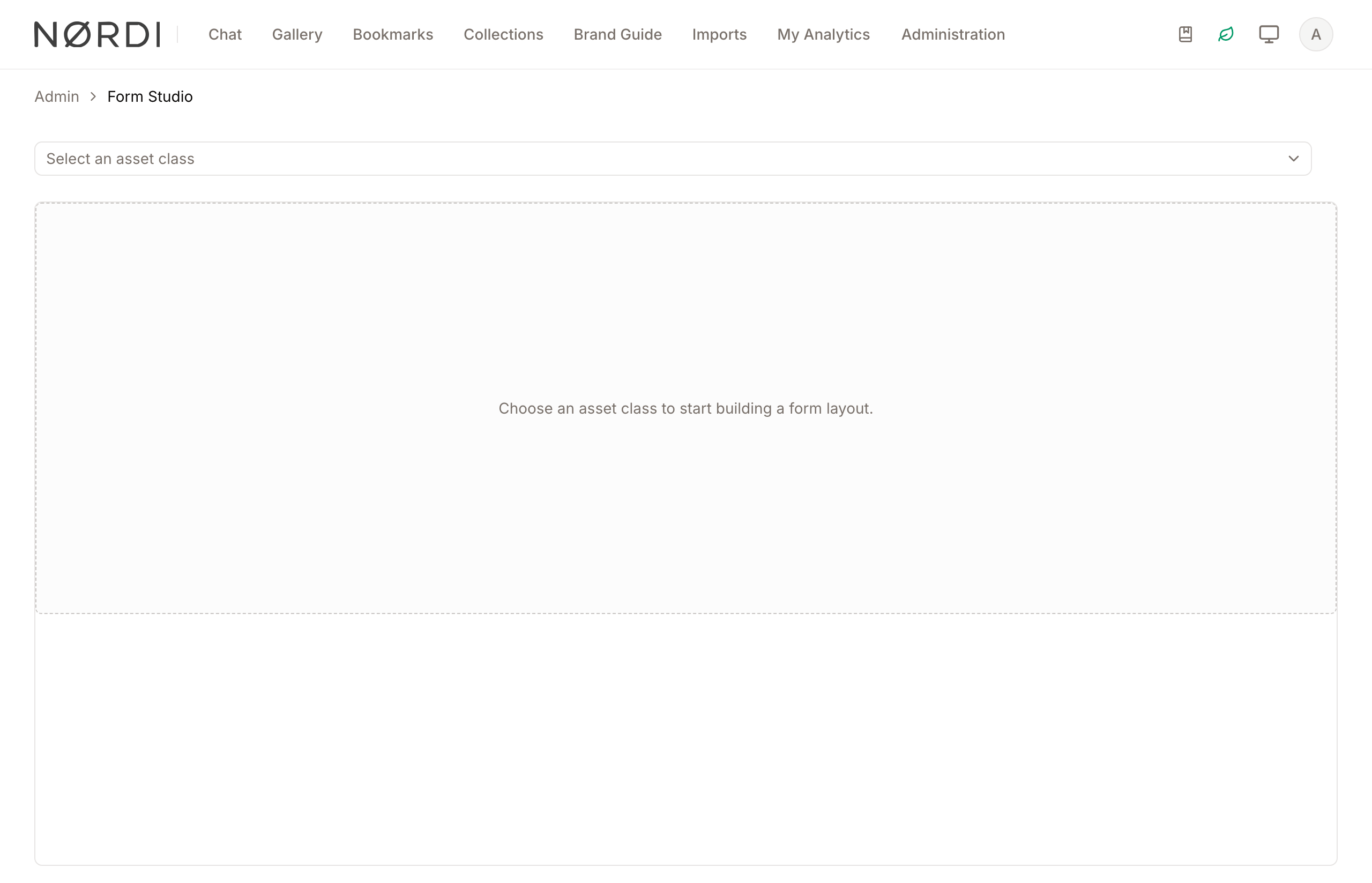
Page Overview
- Purpose: To create, organize, and test the layout of metadata fields for specific asset classes.
- When to use it: Use this when you create a new asset class or when you want to improve the data entry experience for existing assets.
- What you can do here:
- Select an asset class to modify its specific form layout.
- Create and name form sections with 1, 2, or 3-column layouts.
- Drag and drop metadata fields into specific sections.
- Reorder sections and fields to prioritize information.
- Preview how the form looks on Desktop, Tablet, and Mobile devices.
- Test form behavior using different user roles and data scenarios.
Who can use it
Form Studio is reserved for administrators who can manage metadata definitions. If a teammate cannot reach this page or cannot save changes, they need the "Create and edit metadata field definitions" permission.
Page Layout
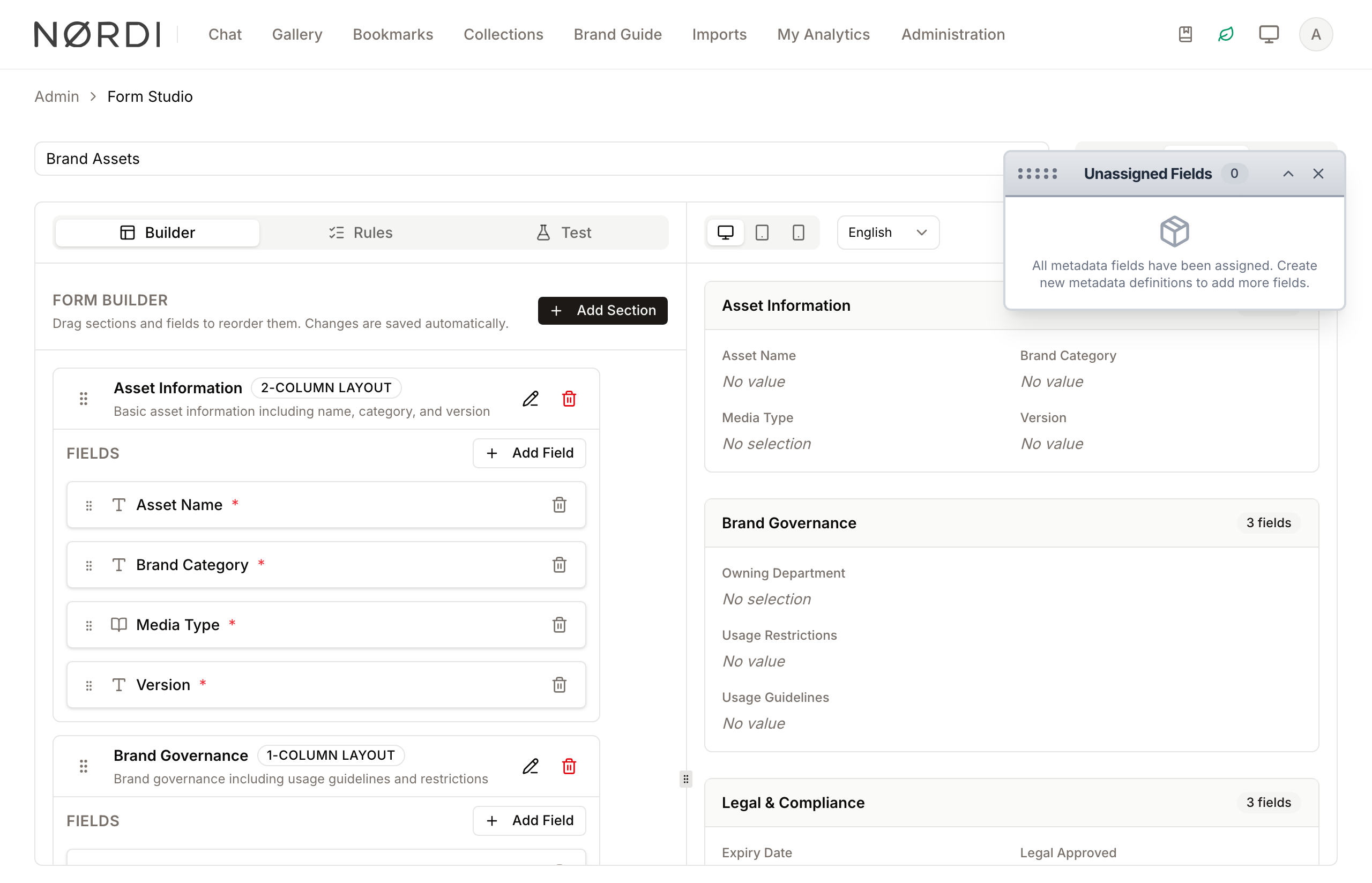
- Top bar: Contains the Asset Class selector (dropdown) and the View Mode switcher (Builder, Split, Preview).
- Left sidebar (Builder Tab): The primary workspace for managing sections and fields. It includes the "Add Section" button and the list of active form sections.
- Floating Palette: A movable window titled "Unassigned Fields" that contains all metadata fields not yet placed in a section.
- Right panel (Split/Preview Mode): Displays a live, interactive preview of the form as it will appear to end-users.
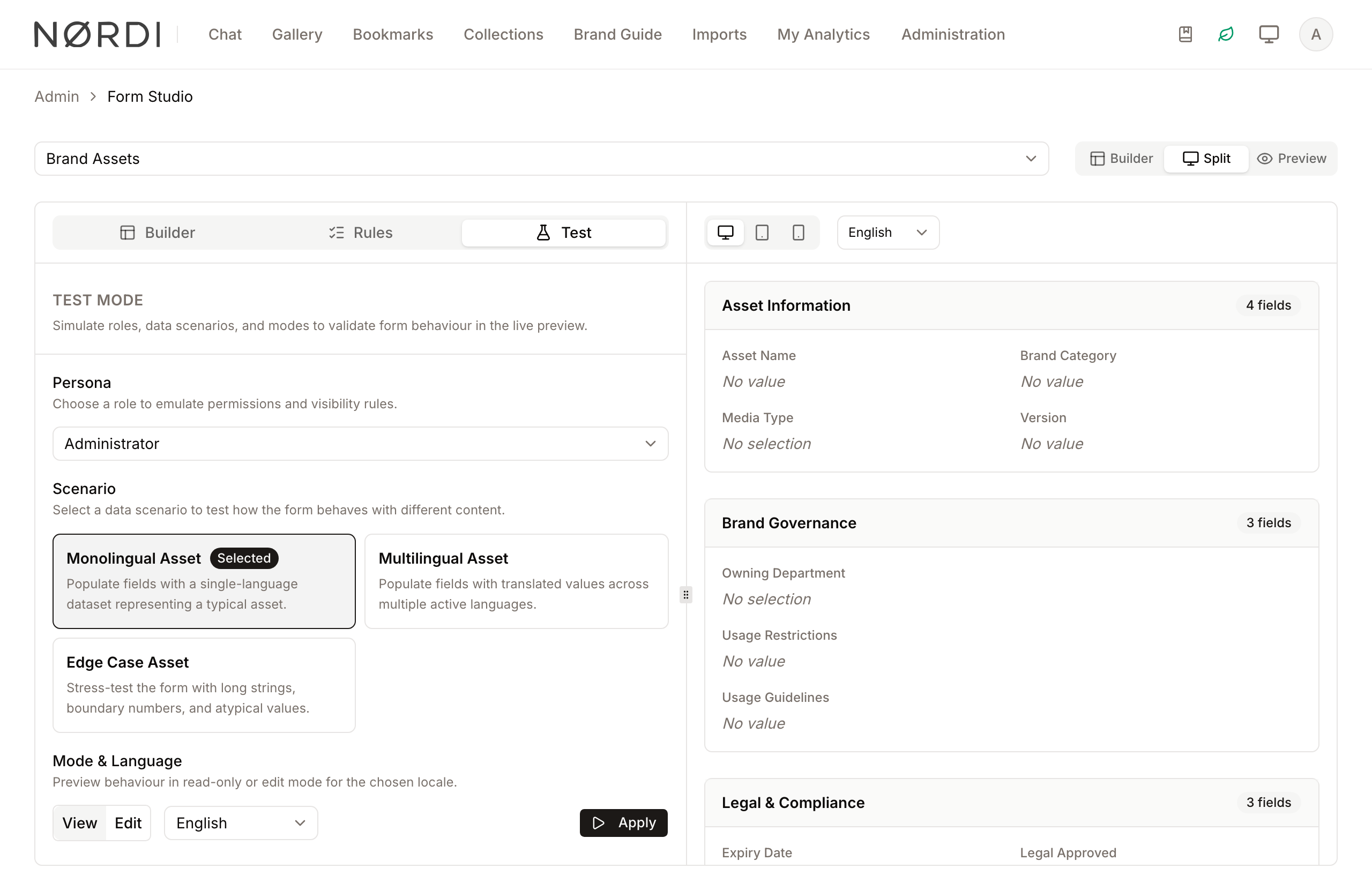
- Test Mode Panel: Accessible via the "Test" tab in the builder area, used to simulate specific user personas and scenarios.
Main Features
Form Builder
- What it's for: The core interface for structuring your form.
- Typical use: Adding new sections like "Basic Info" or "Technical Specs" and dragging fields from the palette into those sections.
- Result: Changes are saved automatically, updating the structure of the metadata form for that asset class.
Live Preview
- What it's for: Seeing real-time visual changes as you build.
- Typical use: Switching between Desktop, Tablet, and Mobile icons to ensure the 3-column layout you chose still looks good on a phone.
- Result: Displays a high-fidelity version of the form, including localized labels.
Test Mode
- What it's for: Validating permissions and conditional logic.
- Typical use: Selecting a "Contributor" role and a "Monolingual" scenario to see which fields are hidden or read-only for that user.
- Result: The preview updates to show exactly what that specific persona would see.
Unassigned Fields Palette
- What it's for: Managing the library of available metadata.
- Typical use: Finding a newly created metadata definition and dragging it into a form section.
- Result: The field is removed from the "Unassigned" list and becomes part of the active form layout.
Detailed Feature Documentation
Section Editor
- Purpose: To define the container properties for a group of fields.
- Where to find it: Click the Add Section button in the Builder header, or click the Edit section (pencil icon) on an existing section card.
- What you'll see: A dialog window with settings for layout, visibility, and translations.
How to use it:
- Enter the Section Name in the multilingual input field.
- Select a Layout (1 Column, 2 Columns, or 3 Columns) from the dropdown.
- Toggle the Collapsible switch if you want users to be able to hide this section.
- Provide an optional Description for administrative reference.
- Click Create Section or Save Changes.
Field Picker
- Purpose: To add multiple existing metadata fields to a section quickly.
- Where to find it: On any Section Card, click the Add Field button.
- What you'll see: A searchable list of all metadata fields currently not assigned to the form.
How to use it:
- Use the Search field to find specific metadata by name or type.
- Click the Checkbox next to one or more fields.
- Click Add Selected.
Test Mode Simulation
- Purpose: To verify that field rules and permissions are working correctly.
- Where to find it: Click the Test tab in the Builder area.
- What you'll see: Configuration options for Persona, Scenario, and Mode.
How to use it:
- Select a Persona (Role) from the dropdown to simulate a specific user's permissions.
- Choose a Scenario (e.g., "Monolingual") to populate the preview with sample data.
- Select a Mode (View or Edit).
- Click Apply.
The three built-in scenarios:
- Monolingual Asset - fills every field with realistic single-language sample data, as if one of your content managers had just entered a typical record. Use this for a quick, everyday preview.
- Multilingual Asset - fills translatable fields with distinct values across three active languages (or as many languages as you have enabled). This is the right choice to check that translation tabs, fallbacks, and language switchers all work as intended.
- Edge Case Asset - stress-tests the layout with exaggerated values: very long strings, large numbers, boundary dates, and atypical data. Use this when you want to be sure a wordy headline or a future-dated value will not break the layout.
The preview automatically reflects the selected role's permissions. Editable fields are locked when the chosen persona does not have permission to edit metadata, and fields flagged as sensitive stay locked unless the persona also has permission to manage metadata definitions. Switching to View Mode locks every field regardless of role so you can review the read-only experience.
Complete Workflows
Workflow: Creating a New Form Layout
- Goal: Build a structured form for a specific asset type from scratch.
- Prerequisites: Metadata definitions must already be created for the asset class.
Steps:
- Select the desired Asset Class from the top dropdown.
- Click Add Section and name it "General Information".
- Set the Layout to "2 Columns" and click Create Section.
- Locate the Unassigned Fields floating palette.
- Drag the "Title" and "Description" fields from the palette into the new section.
- Click the Preview tab to verify the layout.
- Expected result: The form structure is saved, and the preview shows the fields arranged in two columns.
Workflow: Testing Conditional Visibility
- Goal: Ensure certain fields are hidden or shown based on user roles.
- Prerequisites: Field rules must be configured in the "Rules" tab.
Steps:
- Click the Test tab in the Builder area.
- Select a restricted role from the Persona dropdown.
- Set the Mode to "View".
- Click Apply.
- Observe the Live Preview on the right.
- Expected result: Fields restricted by the selected role should disappear or show a "hidden" indicator in the preview.
Workflow: Organizing Fields via Drag-and-Drop
- Goal: Change the order of fields within or between sections.
- Prerequisites: At least one section must exist with assigned fields.
Steps:
- In the Builder tab, locate a field inside a section.
- Click and hold the Grip handle (six dots icon) on the left of the field.
- Drag the field to a new position within the same section or into a different section.
- Release the mouse button.
- Expected result: The field snaps into the new position and the layout is updated instantly.
What happens behind the scenes
- Every layout change - adding a section, dragging a field, reordering items - is saved immediately, so there is no separate "Save" button for structural edits.
- A form needs at least one section. If you try to remove the final section, Freedam will refuse and keep the layout intact.
- Section codes must be unique within an asset class. Freedam will prompt you if you try to reuse one.
- Cascading vocabulary fields (child fields that depend on a parent choice) are populated in the right order during Test Mode, so dependent dropdowns show realistic values that match the simulated parent selection.
Good to know
- The scenario list also doubles as a way to demo the form to stakeholders without touching real asset data.
- Test Mode only affects the preview - it never modifies actual assets or roles.
Tips and Best Practices
- Use Collapsible Sections: For forms with many fields, make less-frequently used sections collapsible to reduce visual clutter for users.
- Mobile First: Always check the Mobile device preview. A 3-column layout that looks great on Desktop will stack into 1 column on Mobile; ensure the vertical order still makes sense.
- Logical Grouping: Group related fields (like "Width", "Height", and "Depth") into the same section to help users find information faster.
- Palette Management: If the Unassigned Fields palette is in your way, use the Window controls to collapse it or drag it by the title bar to a different part of the screen.
Troubleshooting
Issue: "Choose an asset class to start building" message
- Symptoms: The main area is empty and shows a dashed border with a message.
- Cause: No asset class has been selected from the top dropdown.
- Fix: Select an asset class from the dropdown at the top left of the page.
Issue: Field cannot be dragged into a section
- Symptoms: The field snaps back to the palette or its original position.
- Cause: The application is currently processing a previous change or there is a connection error.
- Fix: Wait for the "Updating..." indicator to disappear and try again. Ensure you are dropping the field directly onto a section's field area.
Issue: Preview does not match the Builder layout
- Symptoms: Fields appear in the Builder but are missing in the Preview.
- Cause: You may have a Test Mode persona active that doesn't have permission to see those fields, or the fields are empty and "Hide when empty" is enabled.
- Fix:
- Check the Test tab and click "Apply" with an administrative persona.
- Ensure the fields have data in the selected Scenario.
- Check the field settings in the Rules tab.