
Brand Guide
The Brand Guide serves as the central source of truth for your organization's visual identity. It provides team members and external partners with the official guidelines, specifications, and assets required to maintain brand integrity across all digital and physical touchpoints.
This feature allows you to browse high-resolution logos, copy exact color values, preview typography, and download a complete brand kit in one click.

Page Overview
- Purpose: To provide a centralized, interactive repository of brand assets and usage rules.
- When to use it: Use this page when you need to download official logos, verify brand colors for a design project, or check typography requirements.
- What you can do here:
- Download the complete Brand Kit as a ZIP file.
- Toggle between Light and Dark backgrounds to test logo visibility.
- Copy HEX, RGB, CMYK, and PMS color codes to your clipboard.
- Preview and download specific font files.
- Review "Do" and "Don't" usage examples for brand assets.
Page Layout
- Top bar: Contains the page title, a brief introduction to the guidelines, and the primary Download Brand Kit button.
- Navigation bar: A sticky menu that stays at the top of the screen as you scroll, allowing you to jump quickly to Logos, Emblems, Colors, or Typography sections.
- Main area: Displays detailed sections for each brand category, including interactive asset cards, color swatches, and font specimens.
- Asset Cards: Individual containers for logos and emblems that include preview images, size specifications, and clear space diagrams.
Main Features
Brand Kit Download
- What it's for: Obtaining all brand assets (logos, emblems, fonts, and color palettes) in a single organized package.
- Typical use: Onboarding a new creative agency or starting a large-scale project that requires all brand variations.
- Result: Downloads a ZIP file containing categorized folders for all approved assets.
Interactive Color Swatches
- What it's for: Accessing precise color data for digital and print production.
- Typical use: Copying a HEX code for a web project or finding the correct PMS (Pantone) match for professional printing.
- Result: Copies the selected value to your clipboard and displays a "Copied" confirmation.
Logo Specification & Clear Space
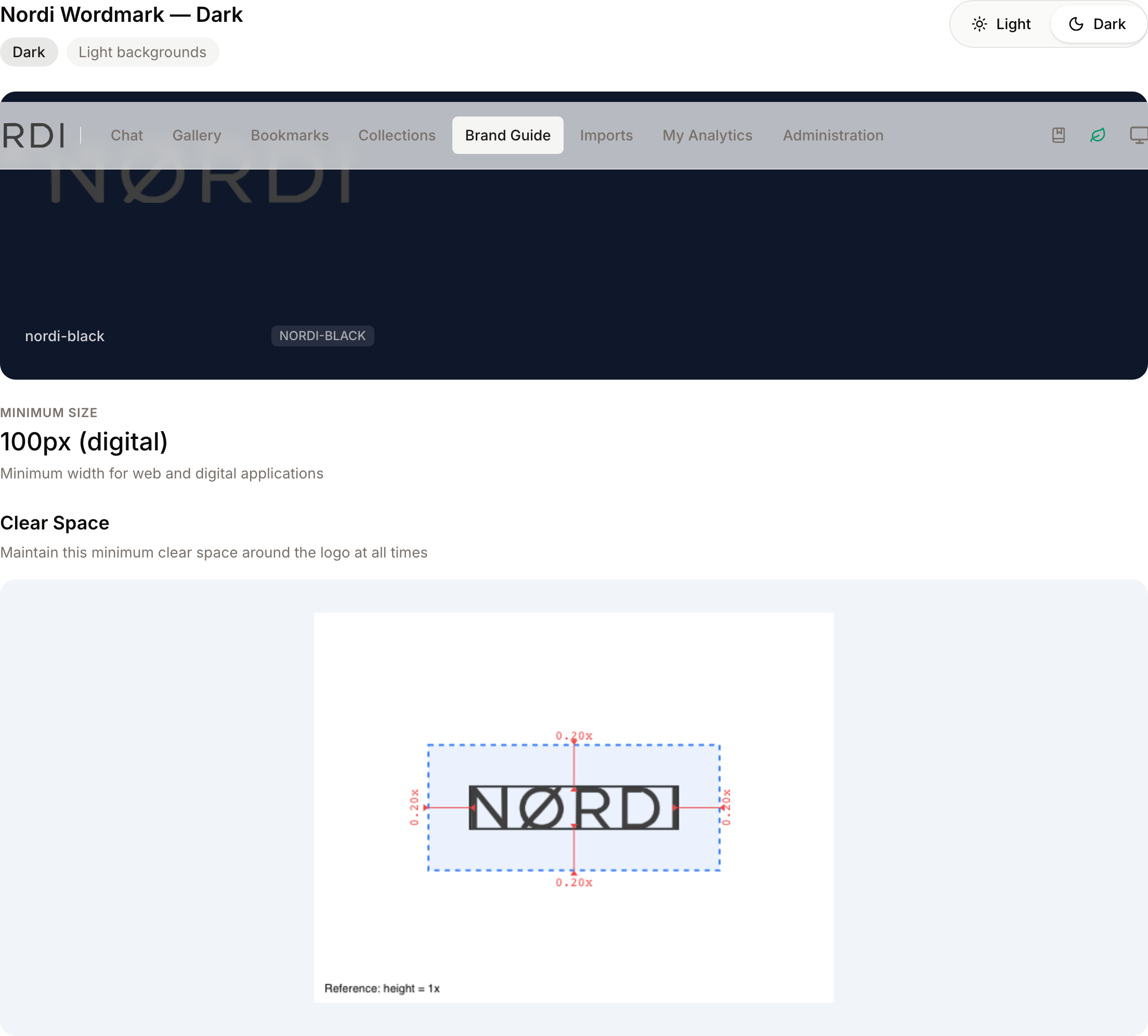
- What it's for: Ensuring logos are used at the correct size and with enough breathing room.
- Typical use: Checking the "Minimum Size" to ensure a logo remains legible on a small business card.
- Result: Displays a visual diagram of the "Exclusion Zone" (clear space) required around the asset.
Typography Specimens
- What it's for: Previewing brand fonts and their various weights.
- Typical use: Checking how a specific font looks in "Bold" or "Thin" before installing the font files.
- Result: Shows a live preview of the character set, weight scale, and size scale for each brand typeface.
Detailed Feature Documentation
Background Toggle
- Purpose: To verify how a logo or emblem appears against different background intensities.
- Where to find it: On any Logo or Emblem card, look for the Light and Dark buttons (represented by Sun and Moon icons).
- What you'll see: The background of the asset preview area will switch between light gray and deep navy, and the text labels will adjust for readability.
How to use it:
- Locate a logo asset you wish to inspect.
- Click the Dark button to see how the "Reverse" or "Monochrome" versions look on dark backgrounds.
- Click the Light button to return to the standard view.
Color Value Copying
- Purpose: To quickly grab color codes without manual typing.
- Where to find it: In the Colors section, within any color palette.
- What you'll see: A list of values (HEX, RGB, CMYK, PMS) below each color swatch.
How to use it:
- Scroll to the Colors section.
- To copy the HEX code immediately, click the large color block itself.
- To copy specific values like RGB or CMYK, click the specific row (e.g., RGB 255, 255, 255).
- A toast notification will appear at the bottom of the screen confirming the copy was successful.
Asset Downloads
- Purpose: To download individual files in specific formats (e.g., SVG, PNG, WebP).
- Where to find it: Hover over any logo preview image, or look at the file list below the preview on mobile.
- What you'll see: Download icons and format labels (like WEBP or SVG).
How to use it:
- Hover your mouse over a logo preview to reveal the download overlay.
- Click the format you require (e.g., the file extension name or WebP).
- On mobile devices, use the buttons located directly below the image preview.
Complete Workflows
Workflow: Downloading the Full Brand Identity
- Goal: Get every approved asset for offline use.
- Prerequisites: Access to the Brand Guide page.
Steps:
- Navigate to the Brand Guide via the main menu.
- Locate the Download Brand Kit button in the top header.
- Click the button.
- Wait for the system to generate the package.
- Expected result: A ZIP file named with the current date (e.g.,
brand-kit-2023-10-27.zip) begins downloading. - If it doesn't work: Ensure you have a stable internet connection; large brand kits may take a few moments to prepare.
Workflow: Checking Logo Usage Rules
- Goal: Determine if a specific logo placement is permitted.
- Prerequisites: The logo must have "Usage Guidelines" assigned by an administrator.
Steps:
- Scroll to the Logos or Emblems section.
- Find the specific asset you intend to use.
- Look for the Usage Guidelines sub-section at the bottom of the asset card.
- Review the images marked with a green checkmark (Do) and those marked with a red X (Don't).
- Read the Caption below each image for specific instructions.
- Expected result: Clear visual examples of correct and incorrect logo applications (e.g., "Don't stretch the logo").
Who can use it
The Brand Guide is a plan-based feature: your workspace administrator enables it on your subscription, and once it is turned on, every signed-in user in the workspace can view it and download from it. There is no separate "view-only" setting to configure - authenticated access is enough. If the page is missing from the navigation, the feature isn't part of your current plan and an administrator needs to enable it.
Editing the guide itself (uploading new logos, changing colour palettes, writing usage guidance) is restricted to administrators in the Branding area of Settings.
What's inside the guide
Everything shown on the Brand Guide page comes from a single curated set of brand assets maintained by your administrators:
- Logos - primary logo files, with their full, horizontal, and monochrome variants.
- Emblems - secondary marks such as crests, icons, or submarks.
- Typography - typefaces the brand approves for use, with preview text and downloadable font files.
- Colour palettes - named colour groups with HEX, RGB, CMYK, and PMS values.
- Usage guidelines - "Do" and "Don't" image examples attached to specific logos or emblems.
Download formats
Three kinds of download are available from the page:
- Brand Kit (ZIP) - a single archive containing all approved logos, emblems, font files, and colour swatches, organised into "Logos", "Emblems", "Fonts", and "Colors" folders. The filename includes today's date so it's easy to tell versions apart when you keep multiple copies.
- ASE colour swatches - an Adobe-compatible swatch file built from the guide's colour palettes. Opens straight into Photoshop, Illustrator, and InDesign. The same ASE file is also included inside the ZIP.
- Individual asset downloads - original file formats for each logo or emblem, plus an optimised WebP variant for web use where available.
What happens behind the scenes
- When administrators upload a new logo or emblem, the system automatically generates a lightweight web preview in the background. That preview is what you see on the Brand Guide page itself, so the originals stay fast to load while still being downloadable at full quality. If a preview hasn't been generated yet for a newly added asset, you may briefly see a placeholder; it refreshes as soon as the preview is ready.
- Updating the guide (new logo variant, revised colour palette, replacement font) triggers previews to regenerate automatically, so the public guide stays in sync without anyone clicking a publish button.
- Every download goes through a permission check tied to your login session, so share links aren't public - recipients need access to the workspace.
Tips and Best Practices
- Use the Navigation Bar: Don't scroll manually through long guides. Use the sticky navigation at the top to jump directly to Typography or Colors.
- Check the ASE File: If you use Adobe Creative Cloud (Photoshop, Illustrator, InDesign), download the ASE file in the Colors section to import the entire palette into your Swatches panel instantly.
- WebP for Web: When downloading logos for website use, choose the WebP option for better performance and smaller file sizes.
- Reference the "X": In the Clear Space diagrams, the unit "X" usually refers to a specific element of the logo (like the height of the icon). Use this as your proportional guide.
- Dated Brand Kits: Because the ZIP filename always includes the date, keep the file around - it doubles as a snapshot of what the brand looked like on that day.
Troubleshooting
Issue: Font previews are not displaying correctly
- Symptoms: The typography section shows standard system fonts instead of the brand's custom typefaces.
- Cause: The custom font files are still loading or your browser has blocked the font-face script.
- Fix:
- Refresh the page.
- Wait 5–10 seconds for the "Fonts Loaded" status to trigger.
- Prevention: Ensure you are using a modern browser that supports WOFF2 or OpenType formats.
Issue: Download button is missing or inactive
- Symptoms: You can see the assets but cannot find a download link or the button does not respond.
- Cause: Depending on your permissions, you may have "View Only" access without download rights.
- Fix: Contact your system administrator to verify your "Brand Guide" download permissions.
- Prevention: Log in with an authorized account before attempting to access the Brand Kit.
Issue: Brand Guide link is missing from the menu
- Symptoms: The Brand Guide page cannot be found from the navigation.
- Cause: The Brand Guide is a plan-based feature and has not been enabled on your workspace.
- Fix: Contact your administrator to enable the Brand Guide module on your subscription.
Issue: A new logo shows a placeholder instead of a preview
- Symptoms: An asset recently added by an administrator displays without a proper preview image.
- Cause: The lightweight web preview is still being generated in the background.
- Fix: Refresh the page after a minute or two. The preview regenerates automatically and does not need any manual action.